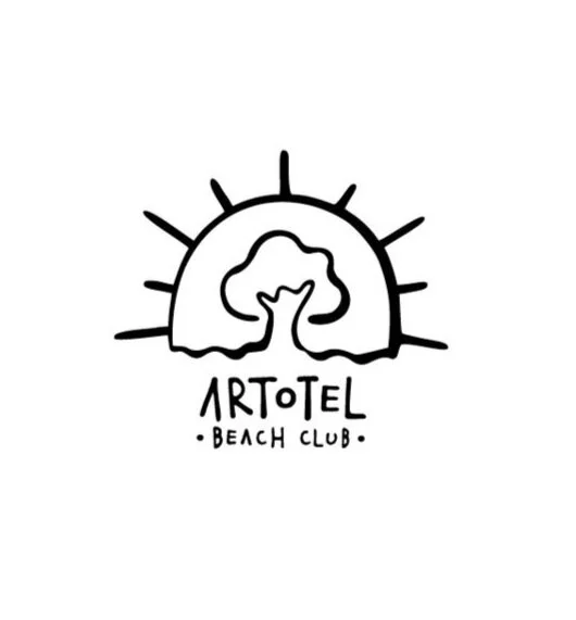
Logo Design
Call it ABC, an easier way to call ARTOTEL Beach Club, a business unit from ARTOTEL Group that focuses only at F&B especially Beach Clubs. ABC will be the playground for local cuisine delicacies and also a hub for locals and internationals.
Concept
The concept is to combine 4 elements which are a tree, the sea/beach, the sun and Saka sign (hang loose). I tried to make these 4 elements as a unity. I also design the typography of the logo for a friendly look since the beach club is selling a kid friendly environment.
Logo Design Process
The initial concept is to use a character as the logo so we can play around with the character for every occasion. The character is a peanut since the architecture of the beach club looks like a peanut and peanut is also a favourite snack to be enjoyed at the beach.
After a lot of exercise we decided to go with this logo. I put the Saka sign as the branch of the tree. The wave and the roots of the tree in one element, and everything is wrapped up inside the sun. The typography is designed based on the style of the logo.

